You want to come up with some killer concepts in lighting design, but have no idea where to begin? Then, this short article is for you.
Think of this as your intro guide… your cheat sheet if you will.
Enough to help you avoid sounding like a doofus in front of your hard working tech, and maybe a way to get you feeling more comfortable with making design choices!
Side bar:
I’m a performing arts educator with a background in producing live theatre. In my time I’ve worked as a lighting tech in venues across Melbourne, completed short courses on lighting design and taught teenagers that a blackout to allow for set changes is blasphemous.
Am I qualified to run the desk at Her Majesties? Definitely not. But I’ve got enough hutzpah, confidence and self proclaimed know-how to work a lighting desk and figure out how to make my actors look good on stage.
Stick with me kid… you’re in safe hands.
The first thing you need to know about lighting design is the following:
Stage lights pull focus. You want your audience to pay attention to something? You point a light at it. And more importantly, you don’t want the audience to focus on something… DON’T HAVE IT LIT
I learnt this the hard way… when I had a colleague operating a follow spot in a school musical, he stopped paying attention and pointed the light up at the roof… it wasn’t until 2 minutes of me staring at the ceiling that I realised I had instinctively followed the light and stopped paying attention to the ACTION ON THE STAGE. IN MY OWN SHOW!
… my colleague was promptly fired from the job and a much more capable 14 year old took over… I’m sure there’s a lesson about old dogs, new tricks and useless teachers being the exception to the rule, here…
Stage lights create atmosphere. The impact the MOOD of the piece and the audience’s experience of what they are watching on stage.
No. You can’t create a “tartan look” with light. That’s costume design.
You don’t need a complicated rig or lighting desk to make impactful choices!
Let’s break this down further.
Focus and tech time.
Talk to your tech. They are humans who are experts in their field.
Consider what you want your audience to pay attention to and ask your tech what lights can help you achieve this. Yes. Talk to your tech. They are humans who are experts in their field… so don’t complain or be a jerk. Work WITH them. Come prepared with a general idea on what you want to achieve, and see how they can help you make it happen. You might not have any control of where the lights are rigged in the space… but you can support your tech by actually using tech time to run through your piece.
Some venues have manual follow spots… you want to give your tech a chance to PRACTICE with the movement. A shaky follow spot can really be distracting… so give them a chance to work with you!
Hot tip: Tech time is for the crew. It’s not about you, dear performer… so make sure you treat it as such.
Atmosphere and Mood.
One of the most common mistakes I see from performers (and my own students!) is when they use colour lighting choices trying to replicate a location. That’s what SET design does.
Here’s the thing… you want the stage to look like a meadow…? Right? A meadow… that’s lush… green… filled with pink flowers… But as soon as you chuck on some green lighting, your actor is going to look more like a sick alien that’s been dragged up through a swamp than a sweet innocent nymph…
Here’s my go to rule book about colour and mood:
Colour
Effect
Cool White Lighting
Clinical.
Cold.
Or even moonlight!
Warm Amber Light
You’ll look the most attractive in this light… and photograph the best!
Nature.
Sunlight.
HOT TIP: Always make sure you have some kind of white face lighting in your design… colours are cool but it’s not cool if we can’t actually see what’s going on.
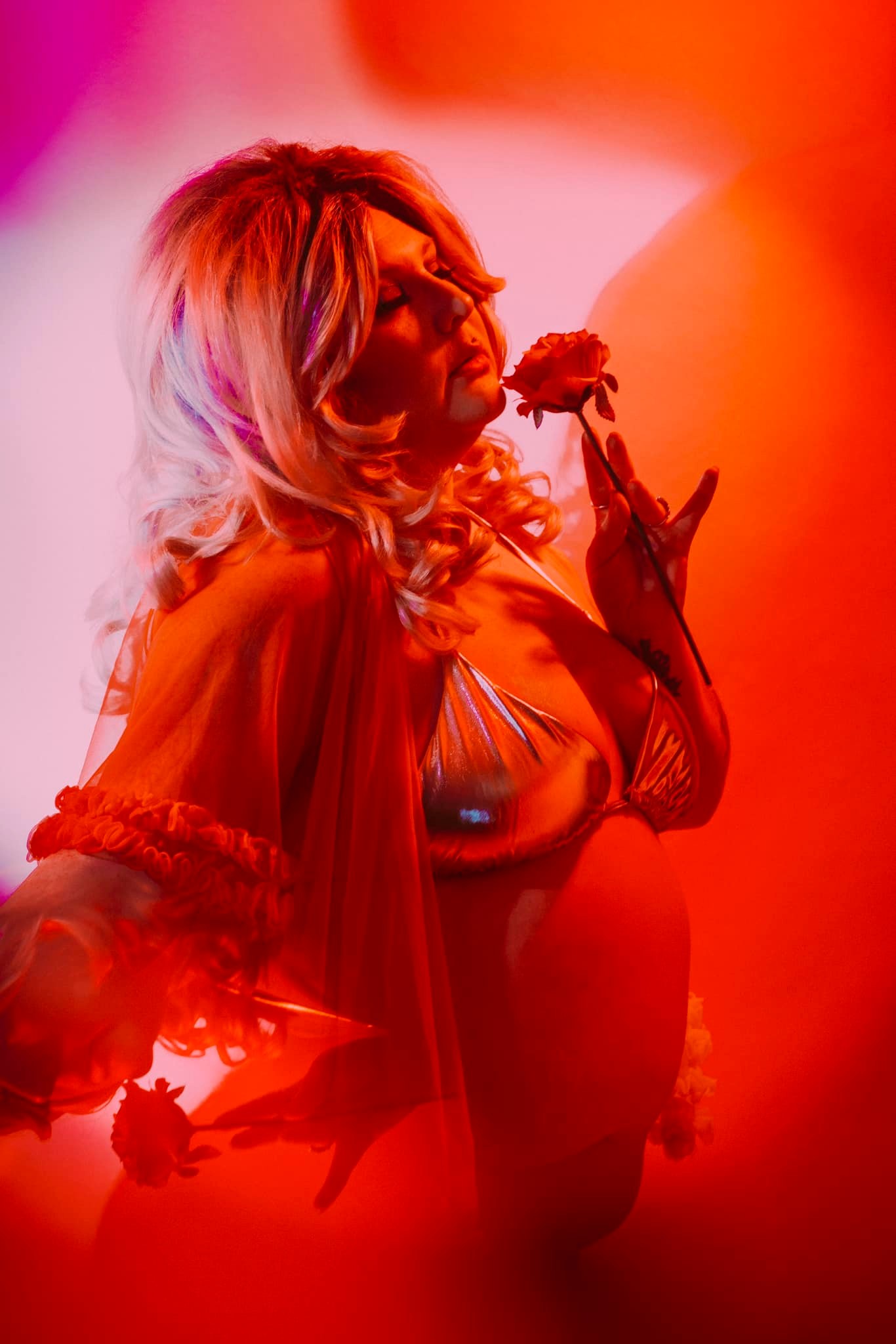
Red
Danger
Threat
Passion
Intense scenes!
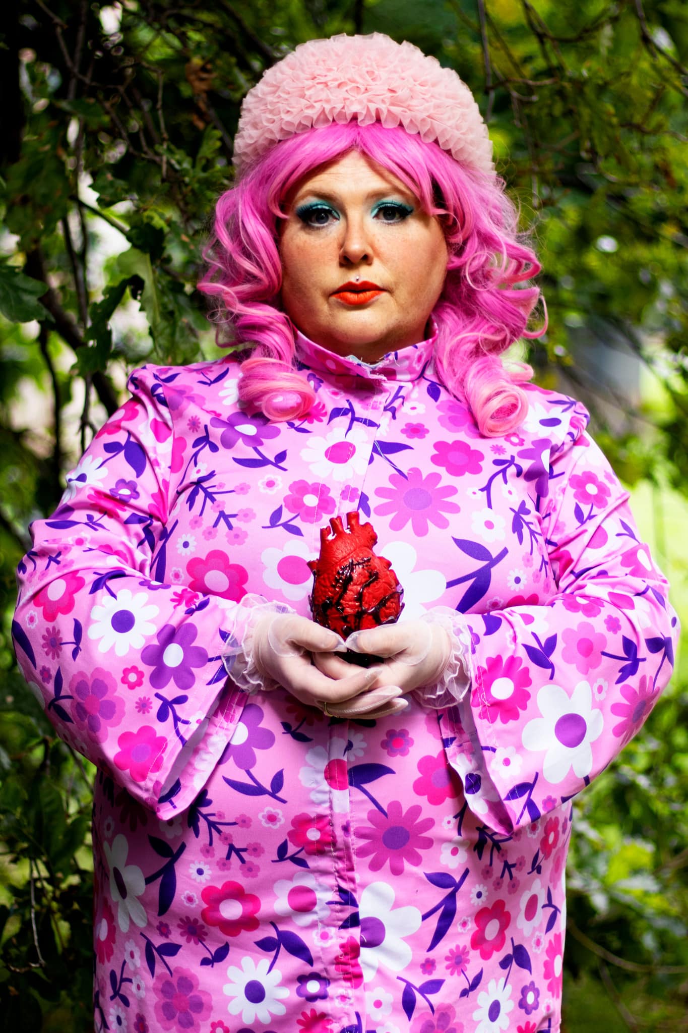
Pink
Romance
I love a snap to pink in a comedic moment…
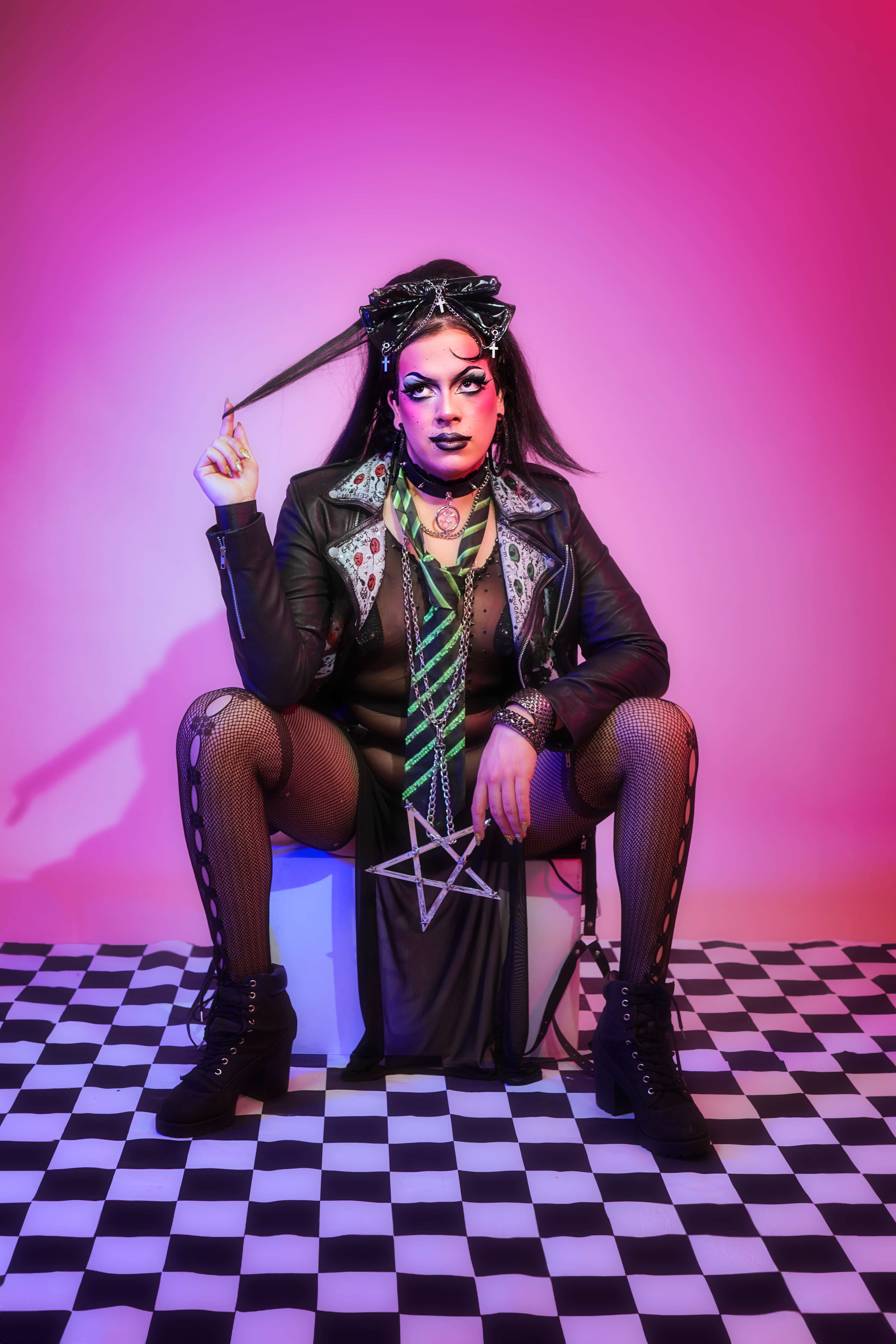
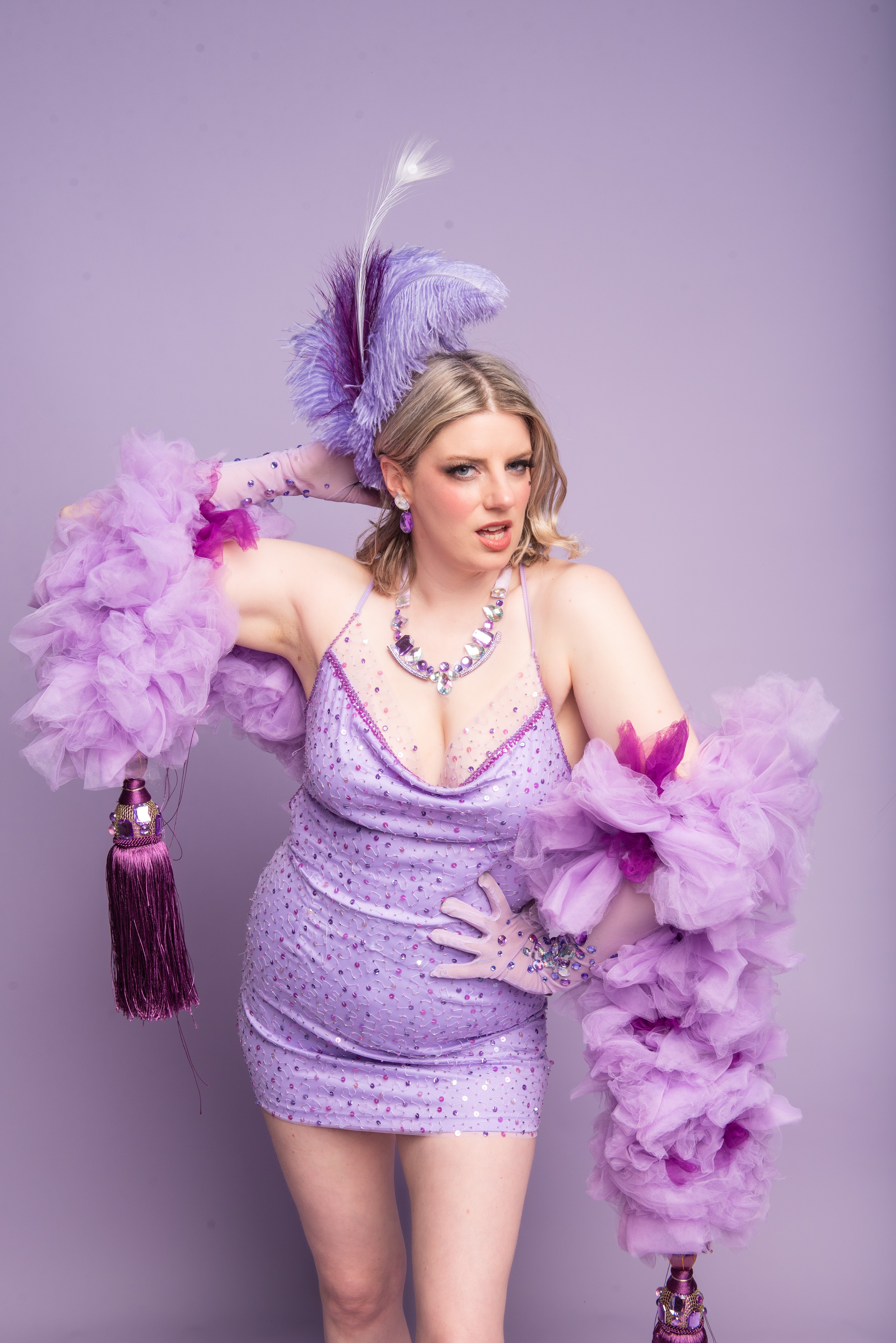
Purple
I reckon this is the most attractive of the lights… It’s a safe option for back lighting to give your scenes more dimension.
Blue
Moody
Moonlight
Night
Green
Only use this if you are referencing the supernatural
Or you’re staging Wicked.
Don’t over complicate it, baby!
Lighting design is one of the best ways to elevate your performance
You don’t need a ridiculous rig or moving lights to make some clever choices. Some things to be aware of:
Ask for a wash of white light from the front. See my table above. You want to be seen!
Colours are amazing for side or back lighting. See my table above for references on moods you can create with them
Consider your scene and routine and think about how you can use a snap of colour change… a fade in our out… to impact the story or mood of the scene! Talk this through with your TECH.
When working with Techs and needing them to change lighting states through your routine: If you are a dancer and don’t have a script – don’t give them a time stamp… give them a VISUAL CUE. Or a lyric in the song. They’re not looking at the music player… they’re looking at YOU.
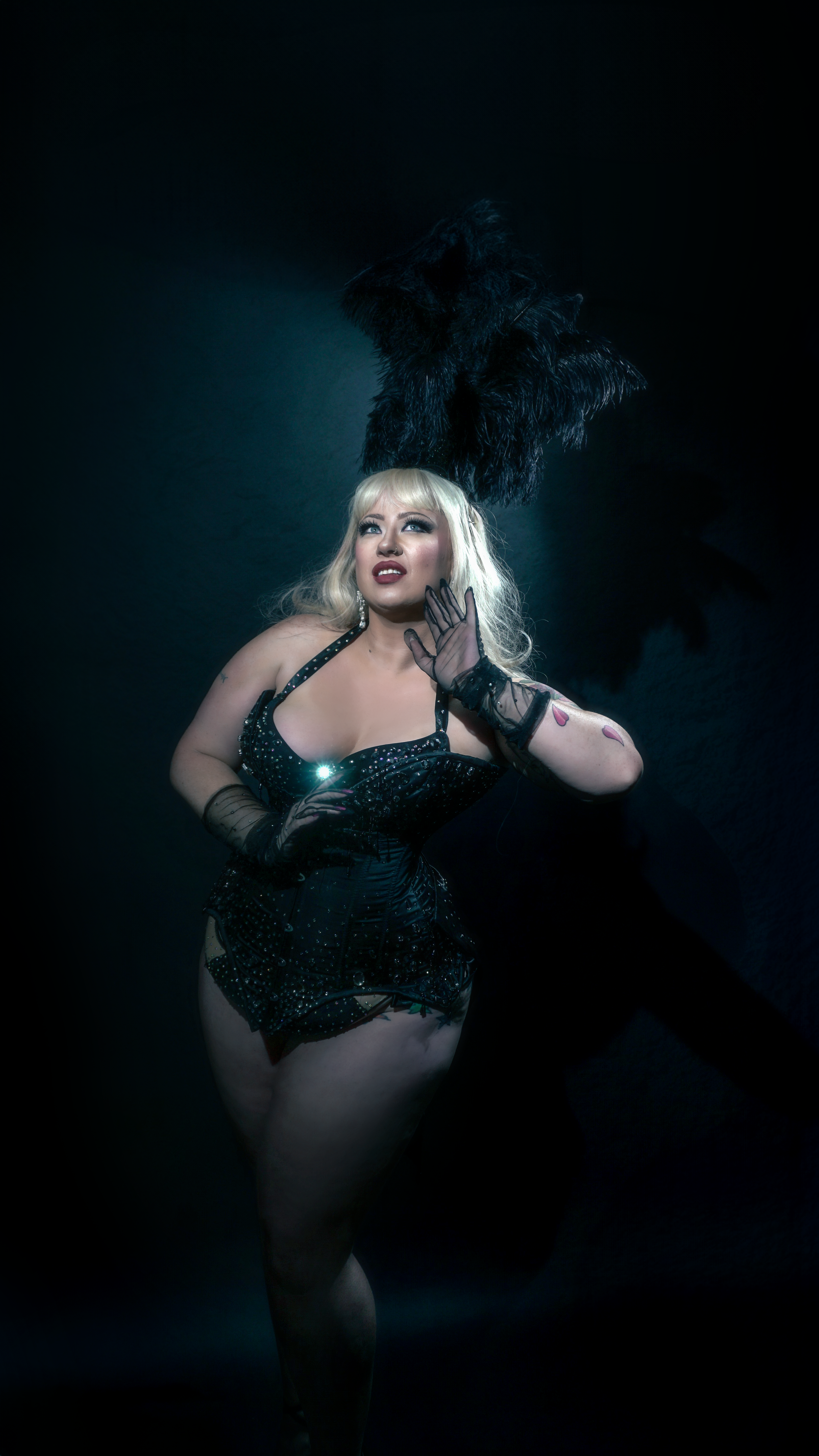
Consider underlighting (a light at the foot of the stage shining up at you) to create a real menacing silhouette on the stage behind you.
Consider back lighting (maybe you start your scene where the performer is in shadow… a colour light shining behind them… only to have the face light fade in during a significant moment in the performance…)
Lighting design is one of the best ways to elevate your performance… so take advantage of the experts in the room. Use your tech time. Ask questions. DO RESEARCH (hello, YouTube some stuff… it’s the little things). And for the love of all things holy, stop using green light.
\n\n
More Articles
The Power of Dance/Movement Therapy.
By Petra Fire
5th Sep 2024You’re greeted by a therapist who invites you to move in weird and wonderful ways and chances are the therapist is also moving with you too.
Read More

Producing Mx Burlesque Victoria
21st May 2024Resilience and grace: what my first year of producing Mx Burlesque Victoria taught me.
Read More

Chica's Mx Burlesque VIC Journey
25th Apr 2024“Me? Do a huge prestigious competition like Mx Burlesque when I’ve only been doing burlesque professionally for a little over a year? No way!”
Read More

Mx Burlesque Victoria 2023
11th Mar 2024I watched Mx Burlesque in 2022 and rather than feeling like it would all be too much, I felt inspired by the performances.
Read More

The Glitter Crash
7th Mar 2024Sallie Cinnamon here, nice person with a lot to offer, and I'm here to teach you how to clean up glitter spills at home.
Read More

Mx Burlesque Victoria
By Moxie Delite
7th Mar 2024My experience with Mx Burlesque Victoria was quite taxing, but rewarding.
Read More

My Mx Burlesque Journey
By Lauren Bok
4th Mar 2024I stand there, in my pink getup, 2 minutes until I’m on stage at Mx Burlesque Victoria, my prop in pieces at my feet.
Read More

Mx Burlesque Victoria 2023
4th Mar 2024Many people have stage fright, and their fear shows on stage.
Read More

Creative Career or Just a Hobby
By Emily White
26th Feb 2024Some things to consider before upgrading your pastime to a side hustle.
Read More
